7 common accessibility mistakes (and how to avoid them)
Optimizing the accessibility of your online product is essential, but how do you get started? We share a number of common accessibility mistakes and share useful tips on how to avoid them within your workflow.


Chances are that you’ve heard about digital accessibility before, and you know it’s important to optimize your online product for people with disabilities. It’s understandable if you feel overwhelmed with all the information and tasks you should do to improve your product. Maybe you’ve concluded that it’s so complicated, you need to hire an expert to do the work. Meanwhile, you care! You just don’t know how to get started.
Don’t worry; fixing or avoiding these issues is often not that time-consuming! That is if you know where to look and what to do instead. In the years I’ve worked as a web developer and front-end software engineer, I’ve encountered many accessibility issues. Often, they boil down to the same set of points. In most cases, an accessibility-minded approach does not take much time. It’s not more difficult or expensive. It’s doing your daily work with a different mindset that improves accessibility tremendously.
But now to the real deal: let me explain what the most common accessibility issues are and, more importantly: how to avoid them.
- Mistake 1: Poor semantic markup
- Mistake 2: Poorly structured form labels
- Mistake 3: Using non-descriptive links
- Mistake 4: Depending on images as the only way to convey information
- Mistake 5: Poor color contrast
- Mistake 6: Not providing a visual indication of the current focus
- Mistake 7: Using unlabelled icons in buttons and links
Mistake 1: Poor semantic markup
Avoiding accessibility issues doesn’t require extra work. It simply requires different work
One of the most commonly made mistakes with regrettably major consequences is poor semantic markup. If you know a little bit about HTML, you might know that a page consists of elements defined by HTML tags, for example <h1> and <p>. The majority of elements are semantic: they clearly describe their meaning in a human- and machine-readable way.
If you’d view the source of any web page, you will also notice a lot of <div> and <span> elements; these are the non-semantic elements. These elements are generic containers, applying no meaning to their content.
Screen readers rely heavily on semantic HTML. They form an accessibility tree based on the semantics of the page. A user with a screen reader can jump from element to element using shortcuts. It tells them which are buttons, which are headings, where the navigation is, how information on the page relates to other elements on the page, and so on.
Overusing non-semantic elements
If you use <div> and <span> elements where a semantic element should have been, essential information is lost instantly. Users who have a visual impairment can’t see the website’s structure based on what they see. They can’t see the buttons or the navigation menu. The web page becomes one big pile of unstructured content. Even worse, often interactive elements - such as buttons - become completely unusable. When surfing the web, I often encounter <span> elements controlled by JavaScript, styled as a button. The JavaScript is written to be activated by a click of the mouse. This works fine for everyone who can use a mouse, but it can’t be controlled by keyboard, and it’s often impossible for a screen reader user to find it at all.
Tip: use semantic HTML
If it looks like a button and behaves like a button, it should be a button
My tip to avoid this unwanted behavior is probably not a surprise: use appropriate semantic HTML elements as much as possible. The only cases you should be using <div> and <span> elements are when there is no other element available to convey meaning. This usually boils down to decorative purposes only.
Using semantic elements will exponentially increase the accessibility of your web page. This is because those contain information for the browser on how they should be used. Moreover, as a developer or engineer, it will even save time. You don’t need to think about mimicking the behavior of for example a button because it already works that way out of the box.
Using the wrong semantic elements
Another common mistake in this category is choosing the wrong semantic element. This is often the result of choosing an element for their looks instead of their behavior or their purpose. Maybe you didn’t use a native <button> because you thought it looked ugly. Or maybe you skipped a few heading levels and chose an <h4> instead of an <h2>, because you liked that it had a smaller font size. This is the wrong way around; we have CSS for that purpose.
Tip: choose an element for its meaning
Use HTML elements to structure your content based on each element’s meaning, not its appearance. Then apply styles to your liking with CSS.
Tip: use automated tools
A nice way to help you with semantics is to use an HTML validator tool. Some tools include this in automated accessibility tests, such as axe Tools. Remember that automated tools can’t test everything and often include false positives and negatives. But it can help quickly spot mistakes you might have overlooked. The best option is to combine automated and manual testing for accessibility.
Mistake 2: Poorly structured form labels
If it looks like a button and behaves like a button, it should be a button.
This error has a lot to do with semantic HTML as well. Make no mistake: designing and implementing a usable, accessible, and nicely looking form is quite a challenge!
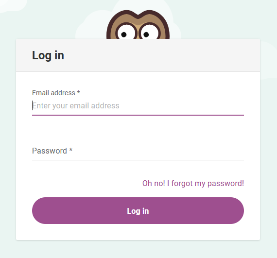
The login form of Easy LMS. The labels move up when you fill in a form field, so they remain visible.
Input and label are not linked
Each form has an input field and a label describing that input field. For example, I have three input fields: “Name”, “E-mail address” and “Company”. I could add the names above the inputs in plain text (such as inside a <span> element 😉). Unfortunately, a screen reader user will find three empty text inputs without an indication of what to fill out.
Tip: pair label and input
Using semantic HTML elements for the labels already goes a long way, but if you really want to help your users, you should also pair your label and input. Now the browser knows that the two belong together. At Easy LMS, we would say: profit!
Using placeholder attributes as labels
Another accessibility no-go is omitting labels and instead using placeholder attributes on the inputs. This is bad practice for a couple of reasons. Firstly, it is often not available to many assistive technologies. Secondly, as soon as a user types in the input (or auto-fills the form), the labels disappear. It’s hard to check the form for errors that way. Lastly, a placeholder is meant as an additional hint - not as a label.
Tip: Don’t replace a label with a placeholder
Never omit labels in a form. If you must, use placeholders only to provide additional hints to (sighted) users in forms. But even better: don’t use placeholder attributes at all and make sure the important information about the form is available to everyone.
Mistake 3: Using non-descriptive links
How often have you come across links that say “click here”, or “read more”, or “go to this page”? My guess: more than you can count! One reason that this is bad practice, is that it doesn’t allow for the understanding of the link’s purpose out of context. With assistive technologies, users can quickly navigate through the links on a page. Imagine a screen reader communicating the following to you: “Here, link. Read more, link. This page, link”. That doesn’t really tell you anything, does it?
Tip: include the subject of the page in the link
So, how do we avoid this? In most cases, this can be solved easily by including the subject or title of the page you’re referring to inside the link. Let me give you an example: you can learn more about different types of disabilities in this article by W3C. Now the screen reader will communicate: “different types of disabilities, link”. Profit!
Tip: optimize repeated links
I can imagine you wouldn’t want to include the title in every “Read more” link under a list of articles. It adds a lot of clutter to the page. There are a number of different approaches on how to make “read more” links accessible, and it differs per use case which one would work best. On the overview of this blog, we chose to optimize the links for screen readers by adding an aria-label that includes the title of the article.
Mistake 4: Depending on images as the only way to convey information
Being a visual thinker, I know how much easier it can be to understand something from an image as opposed to reading text. I won’t claim that using visuals to explain or refer to in an explanation is bad. In fact, I would encourage everyone to use images that way, as for some impairments (such as dyslexia) it actually improves accessibility. However, using images as the only way to convey information is bad practice.
Globally, around 43 million people are blind and around 295 million people have moderate to severe vision impairment. This number does not only include total blindness, but also, for example, loss of central or peripheral vision and blurred vision. If you depend on images to explain your point, you risk that some of your audience will miss a large chunk of the information.
Screenshots
A real-life example of this issue is explaining how to use an interface by using screenshots. The text simply reads, “click the button marked in the screenshot” or “set up your configuration as done in the following screenshot”. Without these images, knowing what to do with those instructions is impossible. Considering these kinds of articles are often found in knowledge banks, documentation, or tutorials, makes it even more problematic.
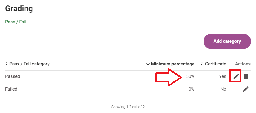
An example of a screen shot from our Help Center. The accompanying text of the help article reads: “You can adjust the settings for your Pass category by selecting Edit”.
Tip: your text should be comprehensible without images
Your audience should be able to understand the information without the images. With instructions in both text and images, your reader can choose their preferred way to take information or has a fallback in case of impairment. A trick I use personally is writing the text as a whole and adding the images afterward, as I did for this blog article. This way, I won’t run into the trap of leaving out information because it was visible in an image while I was writing.
Lack of alternative text
Often informative images you will find on websites either have poor alternative text or don’t have it at all. The goal of alt texts is to describe the image for screen reader users. If this is left empty, screen reader users won’t know what’s on the image or if they missed some important information.
Tip: add alternative texts to functional and informative images
The alternative text will be communicated to a user who can’t see the image (properly). I would encourage everyone not to ignore these but to add a clear descriptive alternative text for the image. This can be done in the source code. In a CMS, there is often a dedicated input field for it.
Tip: handle decorative images for screen readers differently
Sometimes, images are only added as decoration to make a page more visually attractive. Sometimes it is best if images are skipped by a screen reader entirely. There are different approaches how to handle alternative texts depending on the goal of the image.
Text in images
Text in images is also not comprehensible for people with visual impairments. You’d be surprised how much text is inside images (just look at any social media platform). Once again, this is not bad on its own, but make sure you add the text in a description or as alternative text as well.
Mistake 5: Poor color contrast
Choose an HTML element for its meaning, not its appearance
Low contrast text was the most commonly-detected accessibility issue by automated tests conducted by WebAIM. This is not only problematic for people who suffer from low vision but also affects people with color vision deficiency (different kinds of color blindness). Around 1 in 12 men and 1 in 200 women have some degree of color vision deficiency. Some people aren’t even aware that they have this. If you look at the image below, which number do you see?
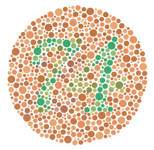
If you see 74, you may have normal color vision. If you see 21 or no number at all, you may have a red-green color vision deficiency. In that case, you may have come across websites with parts that were hard to read.
In the WCAG a Success Criterion is defined for when contrast between text and its background is high enough so people with moderately low vision can read it. The guidelines by WCAG are categorized into three levels of conformance. At Easy LMS, we aim for level AA. These contrast ratios are 4.5:1 for small text and 3:1 for large text.
Tip: use a tool to check the color contrast
So how do you find out if the contrast of the text is high enough? There are many color contrast tools available that you can use to run tests on your web page. You can also test color contrast manually by entering the color codes of the foreground and the background color in an online contrast checker.
Tip: use darker or lighter shades of a color
One challenge that often arises with this issue is that the colors used in the User Interface match the colors of the brand logo. This can make it difficult to address, as the colors feel like they are part of the brand identity. A good practice is to use a darker or lighter shade of the color you desire to improve the contrast. We adjusted the colors of Easy LMS for this reason a couple of years ago!
Using color as the only way to convey information
Earlier I mentioned the problems that stem from using images as the only way to convey information. The same goes for colors. The colors red and green are often used as the only way to inform about success and error states. Unfortunately, red-green color blindness is the most common type of color blindness. For these affected users, red and green will look alike.
Tip: provide multiple ways to communicate states
It’s OK to still use red and green for these purposes, but make sure you always provide another way to communicate states, such as text, different shapes, or (labeled) icons.
Mistake 6: Not providing a visual indication of the current focus
Most users navigate their computers with a pointing device, such as a mouse or a trackpad on a laptop. On mobile devices, we use our fingers on a touch screen. For some users this is either difficult or impossible because of their disability. Examples are paralysis, a missing body part, arthritis, or Repetitive Stress Injury. In these cases, users often switch to a keyboard or an alternative input device that can mimic keyboard behavior. Users with visual impairment mostly use a keyboard alongside their screen reader or gestures on their mobile devices.
If you press the Tab key on your keyboard, you can jump between interactive elements on a web page, such as buttons and links. You can try it on this page: after each tab, you will see a visual indication of your location on the screen.
CSS focus styles
In CSS, you can add styling for several different states of buttons, such as hover, focus, and active. Often, some or all of these states are left out, and the button won’t change appearance with interaction. A keyboard user is flying blind in this case.
Tip: apply focus styles along with the hover styles
While you are adding styles for the hover state of the buttons, it is good practice to add them for the focus states as well. Ideally, the focus style should be more apparent than the hover style, so you can also add them separately in a different shade.
Browser focus outline
A basic focus indicator is provided automatically by the web browser and is typically shown as a border. If you just tabbed through this page, you may have seen it. Sadly, this outline is often disabled with CSS, because of esthetic reasons. But with the outline disabled and no focus styles, it is impossible to navigate a web page with a keyboard only.
Tip: don’t disable the outline
Mouse users won’t see the browser outline you see when you tab through a web page with a keyboard. Don’t disable this outline with CSS, as it is an essential aid for users with a disability. It also works nicely as a back-up in case your focus styles are too unclear or are missing by accident.
Do keep in mind that keyboard focus indicators by browsers can vary and take different forms. For this reason, you can’t rely on them completely. On the other hand, it would take a lot of testing to know for sure if your focus styles are clear enough for users with a disability. That’s why I would advise to always have both.
Mistake 7: Using unlabelled icons in buttons and links
Icons used in software become recognizable with repeated use
Icons are a great way to avoid clutter in your online product. They also have the power to improve accessibility for various disabilities, that is, if they are unambiguous. Most of us know that if we see a pencil icon, it means “edit” and a trash can means “delete”. When we use icons in a User Interface, it’s best to stick with the ones we know to avoid guessing. But even then, in terms of accessibility, a lot can go wrong.
Icons can be used next to their corresponding text label or on their own. More often than not, there is no label provided when on their own. For example, I add an icon button for an edit action, with just an icon of a pencil inside. If I don’t add a text label for this icon, the button becomes an empty button. That is right: a screen reader will communicate to me: “Button”. That is not very useful.
Even more so: I am making an assumption that the user will know that a pencil icon means “edit”. But I don’t know that for sure.
Tip: add a label for icons
If the icon is an important part of your User Interface, then it is best to add a label. You can do this by adding an aria-label on the icon. A second way is to add text that you hide for screens but is visible for screen reader users. It’s best to add a title attribute as well. That way, if a mouse user hovers over it, then the label shows.
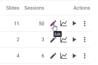
Icon buttons in the Easy LMS dashboard that show a title when you hover over it
Tip: hide decorative icons
If you added an icon purely as sugar on top and the information is comprehensible without it, then it is best to hide the element for screen reader users.
Conclusion: don’t work harder; work smarter
The thought that you need to change these things might still be a bit overwhelming. When I first learned about accessibility, I had the same response. There’s so much to learn and so many different kinds of disabilities. It’s hard to make a User Interface perfect for everyone.
But I want to tell you: it’s not about overhauling your product or website. I’ve found the best way that this works is to integrate it into your workflow. The next time I create or iterate on the part of the product, I apply what I’ve learned about accessibility right away. This way, we can improve accessibility one step at a time. As one of my accessibility heroes Léonie Watson advises: “It doesn’t have to be perfect; it just has to be a little bit better than yesterday.” Preach!