7 ways we’ve made Easy LMS user-friendly
We want to give our clients the best user experience. It takes a lot of steps and mistakes to get there. We share the good, the bad, and the ugly.


We care about our clients. We want our platform to be easy to understand and to use. For everyone. We stay in touch with our clients via support, and we take feedback very seriously. Our tactic: try it out in the “real world” as soon as possible. That way, we get actionable feedback quickly. Sometimes, our solution didn’t work as well as we hoped it would. In that case, we just take the blame, admit we made a mistake, and move on. Mistakes aren’t bad things that shouldn’t have happened. A mistake is an opportunity to learn how to do it better next time.
We do it again till we get it right.
Designing the user experience for Easy LMS is an iterative process. Maybe you’ve seen something change in the dashboard. That’s probably because we found out one of our solutions didn’t work as well as we’d hoped. We listen to the feedback we get from clients, and build on this to come up with new solutions. If this doesn’t go well either, we go back to the drawing board and let our creative juices flow once more. If needed, we do this again and again until we get it right.
We don’t make a secret of our design process or our mistakes. After all, we all make mistakes! Yes, even you! We’re willing to share the good, the bad, and the ugly. Here are some things we’ve done to make Easy LMS user-friendly.
1. Divide user tasks into three jobs
We wanted to take you by the hand and guide you through our platform.
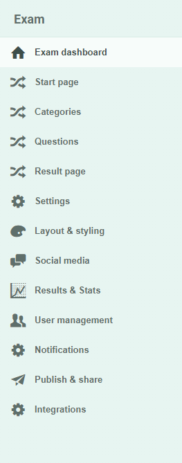
In the beginning, we had one big category for the user tasks within an Exam. Whether you needed to create questions for your exam or wanted to view the results of an exam, you had to look in the same place. As our platform grew, it became harder to squeeze all the tasks into one tiny submenu. There were too many items and a lot of them were hidden behind subpages. There was no clear path to follow. We presented a box of building blocks, but you had to make sense of its contents yourself.
We wanted to take you by the hand and guide you through our platform. Easy LMS kept growing and more features were added. We had to ask ourselves: “How can we present these features in the right way, at the right time?”
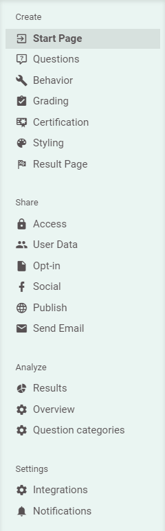
This is where we started splitting up the tasks into three main categories: Create, Share, and Analyze. This way, we don’t distract you with tasks you don’t need. After all, if you’re still creating questions for your exam, you’re not interested in checking the results just yet. We help you focus on the job you need to do. We don’t want to show information you don’t need.
Another thing we did here was to pay close attention to the sequence of the tasks. We admit that at first, we did that all wrong. Just take a look at our old menu: you only have Results & Stats after you’ve shared your exam first! Navigating an exam should be as easy as a walk in the park. Just take a look at our new submenu. Which one do you like better?
2. Split up public and logged in pages
Let’s not beat around the bush: our navigation used to be one big bucket full of all the stuff we had. Here’s another example of one of those “mistakes” we made. The navigation of our public pages was always within reach. Even while someone was logged in and creating an exam. But, how many times do you go back to the pricing page while you’re busy adding questions to an exam? Our guess: never.

This is another example of presenting too many options at the wrong time, and the wrong place. To solve this problem, we split up the website in two parts: a “public part” (which you’re on right now) and a “private part”. The last one is the part you see when you’re logged in. Our public part is tailored to the people who are learning about our product. We want everyone who visits our website to accomplish their goals as soon as they can. This goal isn’t the same everywhere. That is why our navigation changes after you log in. Pretty logical when you think about it, right?
3. Get rid of the wizard
We like to take you by the hand and guide you through our platform. But once upon a time, we took this a little too far.
When we first redesigned our old dashboard, we made a wizard in which you could create an exam. We provided a step-by-step interface that followed the sequence we came up with. The steps were in a logical order. When you walked through the wizard, in the end, an exam was ready and made! Cool, isn’t it?
Soon enough, we found out that you might skip many steps. Or maybe you’d come back later to change things. Maybe you’d jump back and forth between tasks depending on your goal and your own process. There were many reasons why it was bad to squeeze everyone’s process into one linear sequence. Once you were inside the wizard, it was hard to navigate out of. Besides, it was hard to keep an overview. We ditched the wizard pretty quickly and moved to the three-job-navigation we talked about before.
4. Focus on what’s important
We want to help everyone focus on the tasks they want to accomplish. Whether it’s learning or creating learning content.
There are many ways we can facilitate this, and here’s one more. Our navigation is always there, but we don’t make it pop. It’s there when you need it to be. It is designed with calm shades and colors. It’s not meant to be distracting. The navigation is purposely blending with the background of the page. Meanwhile, the section in which the main work happens is presented in a white box. That’s where the magic happens!
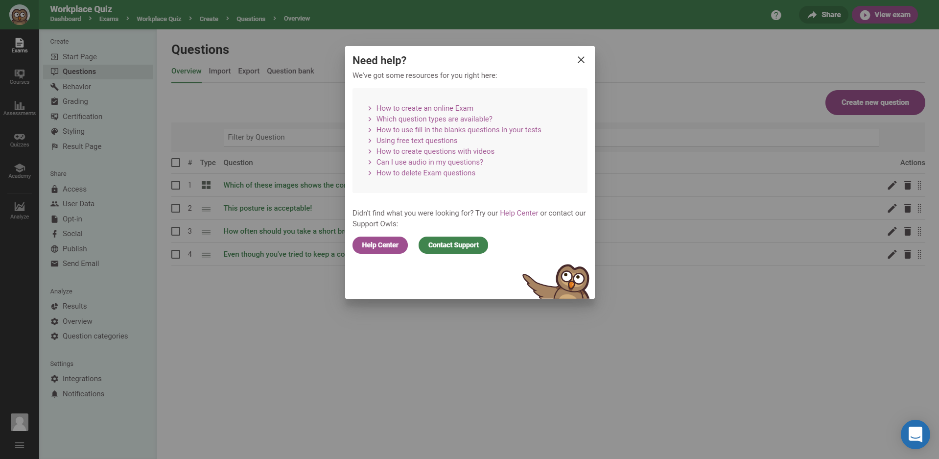
5. Present relevant help articles
We want to help you find the right help article as quickly as possible.
To help you get started with Easy LMS, we have a lot of articles in our Help Center. Although we structure our help articles carefully, we know so much information can be a bit overwhelming. We want to help you find the right help article as quickly as possible.
Previously, we pointed to the Help Center from within the dashboard, but you would still need to find the right help article yourself. This takes you needless time and energy. Besides, we know where the right help articles are. We decided to share this information.
Hence, we made a contextual help menu. Instead of just pointing you to all the articles, we show a list of relevant articles for the page you’re on. Chances are, the article you’ve been looking for is on that list. No need to dig through hundreds of support articles! We present relevant content at the right time.
If you still couldn’t find what you were looking for, you’re only one click away from the chat box with our support owls! We don’t want you to waste your valuable time. That’s why we provided these shortcuts.
6. Show your location
There’s a lot going on in our dashboard. We know! That is why we communicate clearly where you are. The menu item you’re currently in has a separate active state and is styled accordingly. Furthermore, there’s a crumb path at the top of the page that shows your path. These are all helpers to make it clear where you are and how to get back.

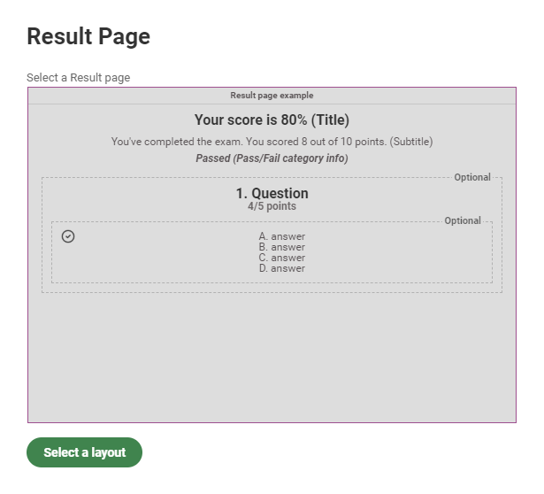
7. Make it visible where we can
Why use a thousand words to explain something, when you can use an image? In this article, I used quite a few images to explain my point. When we’re talking about something that is translated to something you can see, why not show it right away?
This also goes for user interfaces. When we’re talking about the layout of the result page, we could have easily written a story of what it looks like. We could have described how the score goes on top, and the categories and answered questions below that. For us, it would have been much faster and easier than how we did it now. But this forces you to translate our text into a visual image in your head. And for you, that is the hard way.
When you choose a layout for your result page, we show a visual, schematic representation of what it would look like in your exam. What you see is what you get.
In conclusion
“Don’t make me think”, Steve Krug, a well-known user experience professional, wrote in his eponymous book. A web page has to explain itself. What you need to do to accomplish your task quickly needs to be clear in one glance. At Easy LMS, this rings very true to us. We don’t want you to spend time and energy on wondering how our platform works. If you do, we see that as a mistake on our behalf. Then we learn from it and do it better next time. Again, and again, and again.